This tutorial is the 4th in my set of Excel tutorials. You can see the others here:
- Using Excel to design colorwork
- Using Excel to aid in writing multi-sized patterns
- Using Excel to create simple lace charts
And, if you happen to have any tutorials of your own, please let me know.
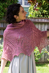
In my last tutorial, I cover creating simple lace charts in Excel. Today, we'll approach a more complex lace pattern and introduce the no stitch. The lace pattern, I'll be covering, is most of the Peri's Parasol pattern I used in Chapeau Marnier.
What is a "no stitch"
More than any other single question, I get this most of all and I think it boils down to a lot of over thinking from the knitting community. Often, people ask if it means a stitch should be slipped. A no stitch, in fact, simply means there is no stitch in that spot. Some lace and cable patterns, change stitch count from row to row. The chart can be made a little more intuitive by distributing the stitches in a logical manner and spacing them with "no stitch" blocks. Generally, when using a "no stitch," one should format it in such a way that it can easily recede from focus. I usually shade mine in gray or black.
Format your spreadsheet
I begin, as always, by adjusting my cells so that they are approximately stitch like in proportion. See the tutorial on colorwork for more information about this step.
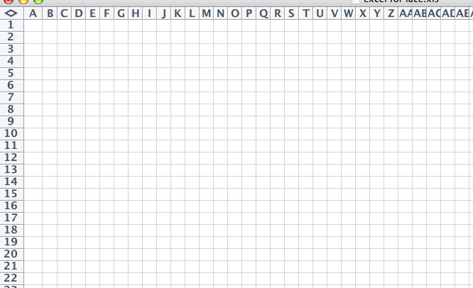
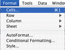
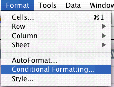
Select all the cells, go to the FORMAT menu and choose CELL
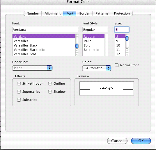
Set the alignment to be centered both horizontally and vertically. This will ensure your symbols are centered. Set your font size and add borders to all your cells.

Conditional Formatting
One of the things that can be hard about converting verbose instructions into charts, is ensuring you always have every stitch accounted for. This can be particularly tricky when there are a lot of knit stitches (which I generally work as blank boxes) and the stitch count changes from row to row. To alleviate this, I use conditional formatting to format all cells as "no stitch" cells unless I input a character. I use spaces for knit stitches. You'll see that up ahead.
To launch the conditional formatting options, with all your cells selected, go to the FORMAT menu to CONDITIONAL FORMATING..
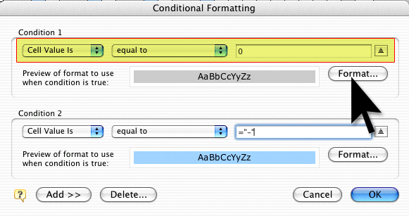
This will bring up a dialog box. In this case, I'll say that all cells that are equal to zero [0] should be formatted in a special way. I'm also going to go ahead and indicate that all cells that are equal to a minus sign [-] are shaded blue. These will be purl stitches.
Begin by setting your Condition as follows:
Cell Value
Is Equal To
0
Now click the FORMAT button
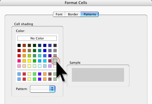
Set the PATTERN to a light gray or whatever you want your background to be.
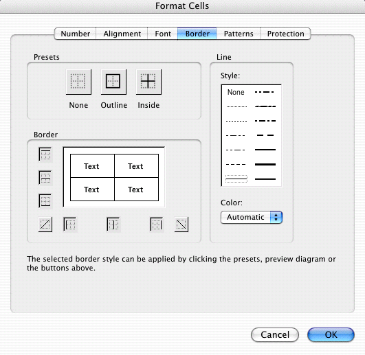
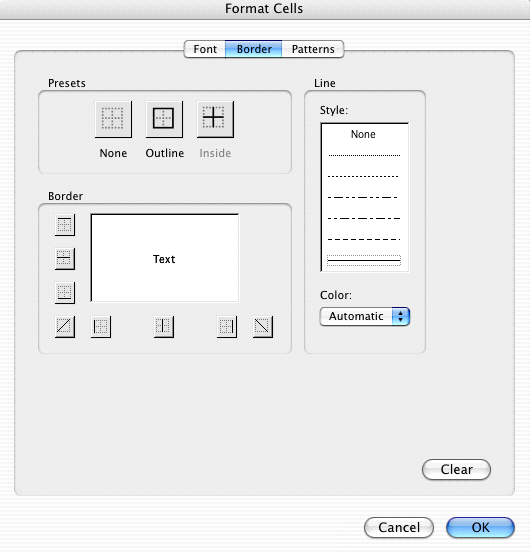
Go to the BORDER tab and turn off all the borders, if you like, or make them a lighter color.
For the purl stitches, set your conditional format so that all cells that are equal to a minus sign, get formatted.
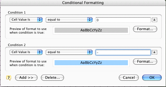
Click the FORMAT button and set the background to blue. Do not change the font or border tabs, this time, just click OK.

Click OK once again to exit the Conditional Formatting window.
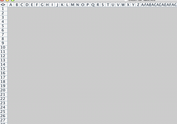
Start the chart
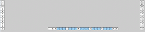
Your screen should look something like this. Note that even though you haven't typed anything in yet, all the cells are gray with no borders. This is the conditional formatting.
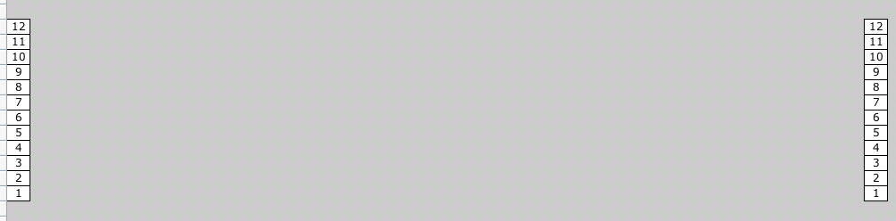
Add your row counts. I had to widen those columns a little to fit the text in. You'll know you need to do the same if you get pound signs instead of the numbers you expected.
I am leaving lots of space between my row count columns, because I know my stitch count will change but I'm not sure by how much.
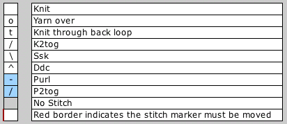
Now begin to enter in your stitch pattern. Here is the key I'm using for this tutorial
The first couple rows are free, the next ones will cost you.
As I indicated before, knit stitches are formed with spaces, all other stitches just employ the code found in the key.
The chart grows confusing.
The first row was pretty straightforward and its subsequent follow up row, which is just worked in the established k/p pattern. But as I continue to add rows, I see that the chart symbols don't seem to align in any meaningful way. Even though every row starts at the same point on the right, they rows grow vastly out of sync by the time we get to the left.

So, here we see all the symbols that I'll be using in this particular chart. In reality, all those blue areas should align. This is a great place for me to start organizing the symbols. Having left myself ample room on either side, I can start to shift the symbols around.

Move it
Select the cells you want to move around. Move your cursor until it becomes a little hand. Now you can drag that group of cells wherever you like.
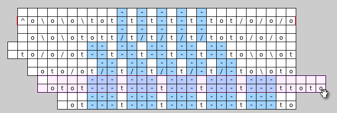
The purl areas, indicated in blue, decrease as you move up the chart. I decided that the blue areas should align to along their left edges. You can certainly choose otherwise.
In order to do this, I'm adding additional NO STITCH blocks into the middle of the chart. You can really see how this begins to build up the shape of the stitch pattern.
Finishing up
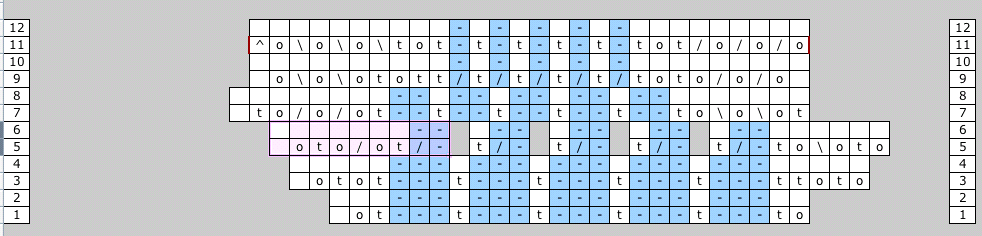
Once all my stitches are aligned, the chart really seems to make more sense. The end result will look like the scalloped edging on the hat.


This pattern can also be set up so that the left edges align and the right edges align and additional no stitches fill in the space to the blue areas. Some charts will lend them selves more logically to a certain format, than others. The nice thing about using a computer is that you can keep playing until you are happy with the results.

Thanks for another easy to understand, fabulous tutorial! :)
I feel rather grateful for all these tutorials you've made available for all of us. I use Excel a lot both at work and for designing, and it's really fun to see how similar (or different) we use a same tool! Thank you!
i love this so much i'm going to post it to the Lime & Violet Daily Chum! hope you don't mind if i use your image of you in the hat!
Ooooh - conditional formatting - what a great idea! I've used excel for similar charts before but always with a good deal of trial and error. Next time I'll definitely borrow your conditional formatting trick. :)
You and your tutorials are too awesome. Thanks for another great one!
Thanks for the great tutorial, I've just started using Excel for designing purposes and this confirms how great a tool it can be. Thanks again!
Pam Gillette
Knotty Generation
Thank you for the time and effort you have given to sharing this information. I have used excel to do a chart, but I knew there were probably better and more efficient ways of using excel than I was aware of.
Thank you so much, again with the brilliant tutorials!