Main

photoshop Archives

September 14, 2007

Photoshop Tips I - Contrast and Color with Curves

Most images can be clicked for a closer view

A little caveat before we begin. I'm not a color correction expert, though I do need to know the basics for the work I do. Most of what I've studied has been for print, not for web, though many of the concepts remain largely the same.

Furthermore, images look really different on a Mac than they do on a PC. Most people are on PCs and I'm on a Mac, so while may think a picture looks good on my screen, you might not.

And that brings me to the last point. A lot of color correction is subjective. There are some things that are fairly universal. For instance, a light color cast to an image is usually apparent to most people. but the perfect amount of contrast and brightness may be different depending on personal preference, age and monitor. Did you know that many people's vision yellows slightly with time? Older monitors will often display color much differently than newer models, as well, so there are a great many factors that can impact how you view an image.

Some basic stuff that makes me sound like I know what I'm talking about

While there are quite a few different color spaces, the two you are most likely to deal with and work in are RGB [red, green, blue] and CMYK [cyan, magenta, yellow, black]. RGB colors are those that display on monitors. It's the means by which light produces color. CMYK space is what your home printer generally uses (though some contain additional colors to produce a wider range of shades). If you are familiar with the old color wheel, containing primary, secondary, and tertiary colors, you understand the basics of how CMYK colors work. While the primaries are a little different (not red yellow and blue, but cyan, magenta and yellow,) the way in which colors combine remains largely the same. Add the right amount of yellow the right amount of cyan and you will get shades of green. RGB works in the opposite manner. In RGB, when you have 100% of each color, you get white. Do the same in CMYK you get black. Most of us find this counter intuitive, but when you are making your edits you should not switch to CMYK and back to RGB. You must learn to modify your colors in RGB if you wish to maintain the detail of your image.

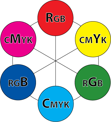
I've made this little graphic to help you understand how the RGB colors relate to the CMY colors (don't worry about black)

There are 6 color swatches below. every other swatch is an RGB shade and the alternate are CMY colors. Colors located across from each other are related. When working in RGB, reducing the amount of the RGB shade will increase the CMY shade. For instance, let's say your image has a red cast to it. In some images, this might be interesting, but if you are photographing a lush summer landscape in the day, the red cast will make your gorgeous greens look muddy. Reducing the amount of red in the image will make those greens pop.

So how do you apply this novel bit of trivia? Well, I'm glad you asked. (You asked, right?) I apply this, most frequently in the CURVES dialog box.

Continue reading "Photoshop Tips I - Contrast and Color with Curves" »

September 17, 2007

Photoshop Tips II - Levels and Histograms

Most images can be clicked for a closer view

In our last tutorial, we discussed Curves. Today we'll be talking about Levels. Levels can be used in the exact same way as Curves, though the interface is a little different. The cool thing about Levels is that you can actually see a visual map of your image and the colors displayed within.

As with the last tutorial, all the caveats still apply. Your mileage may vary. I'm no expert, blah blah blah, color correction is subjective, etc.

I've chosen a photo and opened the Levels dialog box by going to the IMAGE menu, to ADJUST and choosing LEVELS. You can also access this option by pressing [CTRL+L] or [CMND+L], depending on your computer platform.


This picture of Thea seems a little dark in the three-quarter tones (those between the middle and shadow tones). Her face, next to the couch, seems a bit muddled and lacking in detail. When I pull up the Levels palette, I see my impression confirmed. Let's take a closer look.

Click image to see the tonal ranges

Here we see a graph of the distribution of pixels. On the left, indicated by a black slider, is the shadow area of the image. This image has a large majority of its pixels between the midtones and shadows. At the far right, the highlight point shows absolutely no pixels. We don't have any pure white in this image.

From the Layers palette, I can move those sliders, under the graph, to adjust the tones in the image. We have two sets of sliders we can move. The top set of sliders consists of three tonal ranges. On the left, shadows, in the middle, midtones, and on the right, highlights.

The bottom set of sliders has just a shadow and highlight slider.

Continue reading "Photoshop Tips II - Levels and Histograms" »

November 26, 2008

Using Photoshop to color your sketches

Most images can be clicked to zoom.

Perhaps you need to submit sketches of a pattern for consideration in a publication, or maybe you are just designing for yourself and want to play with color combinations, regardless of your reasons, you don't need a full set of pencils and markers to colorize your drawings and if you use Photoshop, you change the colors over and over again, without having to do a new drawing. I'm going to cover some very simple techniques, that you can build upon to create your own style.

As with all my tutorials I want to make it clear that I'm not an expert, these are just some suggestions. I don't supply support for these methods and cannot offer instructions for older versions or open source alternatives to the program indicated. I am using Photoshop CS3 on a Mac, but will try to provide PC equivalents when I know them.

And, of course, if you have any suggestions, leave them in the comments. I love learning new tips.

Start your sketch

You may download my original, unretouched sketch here, and play along at home. The final document is available here.

I generally do my sketches on paper. I'm not a fine artists, so I often use catalogs as reference for the way clothing drapes and the correct proportions for the human form. I don't like to actually trace images, because I think this looks too stiff. I prefer to just use the image as a visual reference and draw the images by hand. You should do what produces the best results for you.

In this case, I want to draw a skirt. I looked around online and found this cute number over at the Gap. I lightly drew my sketch with pencil then outlined only the most important features with a thick dark marker.

If you have a scanner, great, scan it. I have one but I generally just take a picture with my digital camera, like I have here. The lighting was atrocious that day, so the paper is pretty dark, but that's totally fine.

Now, open the image in Photoshop.

Continue reading "Using Photoshop to color your sketches" »

About photoshop

This page contains an archive of all entries posted to Marnie, speak! Good girl. in the photoshop category. They are listed from oldest to newest.

illustrator is the previous category.

word is the next category.

Many more can be found on the main index page or by looking through the archives.

Site Info

Powered by
Movable Type 3.35