Pre-drafting stubborn fibers
I miss El Matchador but I'm rekindling my love for my beautiful little spindles while I'm here in India.
I've noticed that there is a wave of knitters taking up spinning lately and so I have a couple of simple tutorials I plan to post while I'm here, to help the newbie. I'm sure these are "well duh!" items for most people but they have been useful for me so perhaps they will be useful to others.
Today's tutorial will be on pre-drafting fibers that are being a bit stubborn. If you don't know how to pre-draft yet, there are a couple videos here. The process involves separating your roving into strips then gently tugging the fibers, lengthwise, to loosen them up.
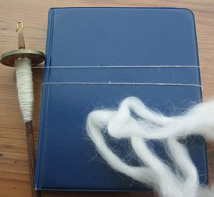
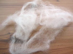
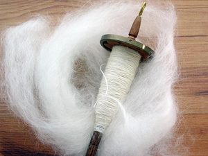
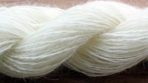
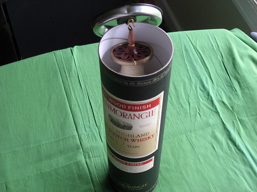
I'm spinning some pygora right now, on my 0.9 ounce Golding spindle. The pygora is prepared as a pencil roving, meaning you do not need to separate the roving into separate strips as it's already thin enough.
Pygora spins up beautifully when properly pre-drafted
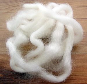
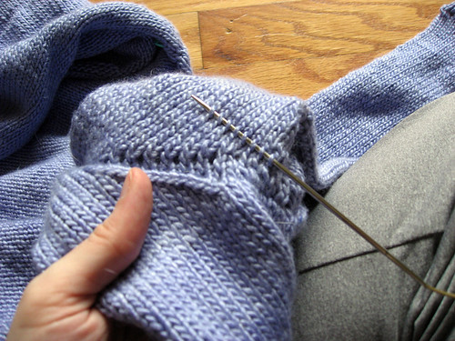
However, this particular batch has some areas that are a wee bit hard to pre-draft. I think areas have matted ever so slightly in transport, making them impossible to pre-draft the normal way. The solution is as follows.
Break off a length of roving to your liking. I prefer a couple feet of roving, many other people prefer a shorter, more manageable length. Do what you like best.
Attempt to pre-draft as you normally would.
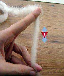
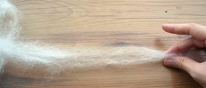
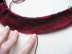
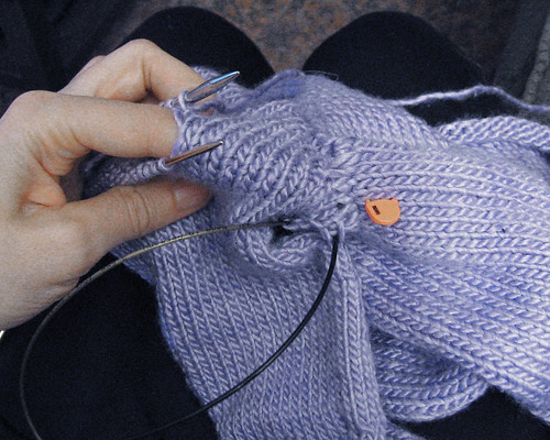
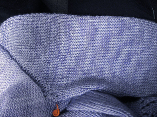
Excuse the awkward photo, I only have 2 hands and no tripod. Imagine I was trying to do that with both hands.
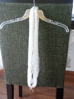
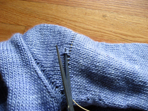
To loosen the fibers, begin stretching the roving side to sides. Gently part the fibers, starting at one end and working up the length of the roving.
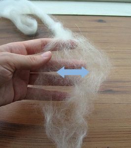
When you hit the matted area, spend extra time carefully releasing the fibers. Remember, you don't want to break any of the fibers, just loosen them up.
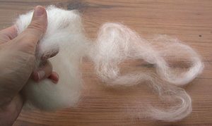
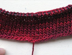
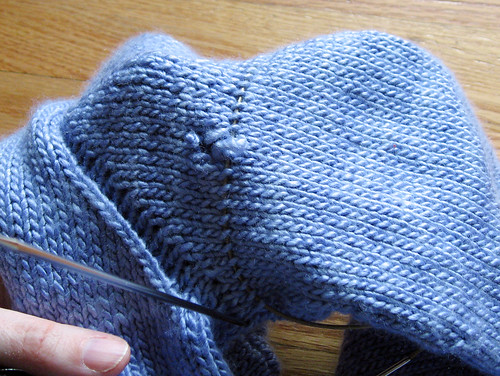
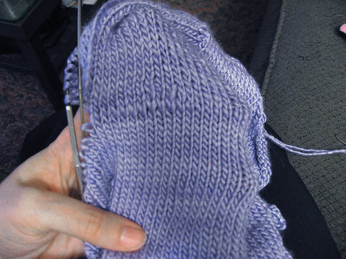
When you have worked the entire length of the roving, you have something that looks a little like this.
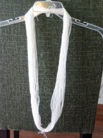
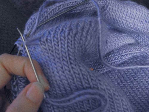
I then like to tug the roving, very gently, lengthwise. This not only makes it a little easier to handle, but it allows you to pre-draft it a little more.
Again, this should really show me doing this with two hands.
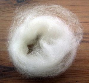
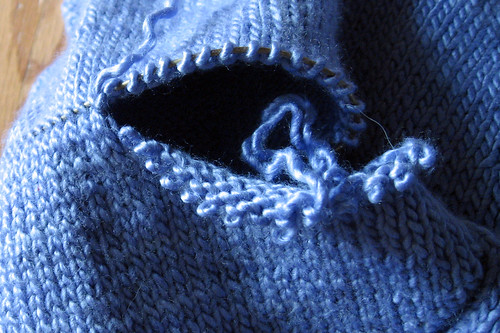
When you are all done, you can wind it around your distaff (if you have one) or, as I prefer to do, make a little bracelet out of the fiber, by winding it around your hand.
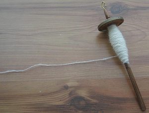
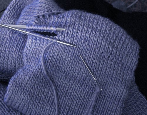
The finished roving looks like this:
Now just spin spin spin.
Next tutorial will be on achieving a balanced two ply on your spindle.


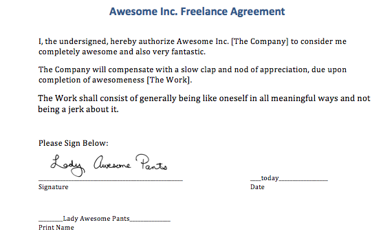
 selected from your toolbar click the signature.